Creating an Effective Executive Cybersecurity Dashboard that Drives Informed Decisions
- John Christly

- Mar 4
- 4 min read
Cybersecurity is a critical concern for organizations today, yet many executives struggle to grasp the complex technical details involved. An executive cybersecurity dashboard can bridge this gap by presenting key information in a clear, concise way that supports fast, informed decision-making. Designing such a dashboard requires careful thought about what metrics to include, how to visualize data, and how to simplify complex concepts without losing essential details.
This post explores the key elements that make an executive cybersecurity dashboard user-friendly and effective. You will learn which metrics resonate most with board members, how to simplify cybersecurity information, best practices for layout and design, examples of successful dashboards, and recommended tools to build your own.
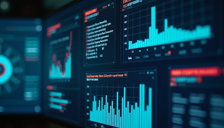
Essential Metrics and Data Visualizations for Executives
Executives need a high-level view of cybersecurity risks and performance, not technical minutiae. The right metrics help them understand the organization's security posture and prioritize actions.
Key Metrics to Include
Threat Landscape Overview
Show the current number and types of threats detected, such as malware, phishing attempts, or intrusion attempts. Use trend lines to highlight increases or decreases over time.
Incident Response Status
Display active incidents, their severity, and resolution progress. This helps executives see how quickly the security team addresses issues.
Vulnerability Management
Highlight the number of critical vulnerabilities found, patched, or outstanding. This metric signals how well the organization manages known risks.
Compliance and Policy Status
Show compliance with relevant regulations (e.g., GDPR, HIPAA) and internal security policies. Use simple indicators like green/yellow/red status lights.
User Behavior and Access Controls
Summarize unusual login attempts, privilege escalations, or access violations. This helps executives understand insider risks.
Security Awareness Metrics
Include results from recent phishing simulations or training completion rates to show how prepared employees are.
Effective Data Visualizations
Dashboards should use clear, simple charts:
Bar charts for comparing incident counts, line graphs for trends, pie charts for threat distribution, and gauges for compliance status.
Heat maps can highlight areas of high risk or frequent attacks.
Traffic light indicators (green, yellow, red) quickly communicate risk levels.
Drill-down options allow executives to explore details if desired without cluttering the main view.
Simplifying Complex Cybersecurity Concepts
Cybersecurity involves technical jargon and complex processes that can overwhelm non-technical executives. The dashboard should translate this complexity into understandable insights.
Use plain language rather than technical terms. For example, say "unauthorized access attempts" instead of "intrusion detection events."
Provide context for metrics by explaining why they matter. For example, "A rise in phishing attempts increases the risk of credential theft."
Avoid information overload by focusing on the most relevant data and summarizing details.
Use analogies or comparisons to familiar business risks, such as comparing vulnerability patching to fixing building security doors.
Include brief tooltips or info icons that offer quick explanations without cluttering the screen.
Best Practices for Layout and Design
A well-designed dashboard enhances comprehension and decision-making speed. Here are some design tips:
Prioritize information hierarchy
Place the most critical metrics and alerts at the top or in the center where eyes naturally focus.
Group related data
For example, cluster all threat-related metrics together and separate compliance indicators.
Use whitespace effectively
Avoid crowding elements; whitespace improves readability.
Consistent color coding
Use colors consistently to represent risk levels or status across the dashboard.
Responsive design
Ensure the dashboard works well on different devices, including tablets and laptops.
Limit the number of visual elements
Too many charts or graphs can overwhelm users. Aim for clarity and simplicity.
Interactive elements
Allow executives to filter data by time period, business unit, or threat type for tailored views.
Real-World Examples of Successful Dashboards
Several organizations have developed executive cybersecurity dashboards that effectively communicate risk and performance.
Financial Institution Dashboard
A major bank created a dashboard showing real-time threat alerts, incident response times, and compliance status. The dashboard uses color-coded risk levels and trend graphs, enabling executives to quickly assess security posture and allocate resources.
Healthcare Provider Dashboard
This dashboard focuses on compliance with HIPAA and tracks phishing simulation results alongside vulnerability patching rates. It uses simple gauges and progress bars, helping executives understand readiness without technical details.
Technology Company Dashboard
The company’s dashboard integrates user behavior analytics with threat intelligence feeds. It highlights unusual access patterns and emerging threats, allowing executives to prioritize investigations.
These examples show the value of tailoring dashboards to the organization's industry and executive needs, focusing on clarity and actionable insights.
Recommended Tools and Technologies
Building an effective executive cybersecurity dashboard requires the right tools. Here are some popular options:
SIEM Platforms (Security Information and Event Management)
Tools like Splunk, IBM QRadar, and LogRhythm collect and analyze security data and often include dashboard capabilities.
Business Intelligence Tools
Platforms such as Tableau, Power BI, and Looker allow custom dashboard creation with flexible visualizations and data integration.
Dedicated Cybersecurity Dashboard Solutions
Products like Cybersecurity Dashboard by Rapid7 or Arctic Wolf offer pre-built templates designed for executive reporting.
Open Source Options
Tools like Grafana can be customized to display security metrics from various data sources.
When choosing tools, consider integration with existing security systems, ease of use, customization options, and the ability to present data clearly to non-technical users.
Empowering Executives with Clear Cybersecurity Insights
An executive cybersecurity dashboard is a vital tool for translating complex security data into clear, actionable insights. By focusing on essential metrics, simplifying technical concepts, and applying thoughtful design principles, organizations can equip their leaders to make informed decisions that protect the business.


Comments